
Web Analytics
Building A First-party Data Strategy For Ecommerce After The Cookie
Third-party cookies are gone and platform signals keep shrinking. We show you what data to collect first, how to activate it, and where it outperforms.
Read MoreIf you are still emailing CSV exports every week and rebuilding the same slide deck every month, this guide is for you. Google Data Studio (formerly…


If you are still emailing CSV exports every week and rebuilding the same slide deck every month, this guide is for you. Google Data Studio (formerly Google Data Studio) lets you connect your data sources once and build a live, interactive dashboard that updates itself automatically. Your clients explore it on their own. You spend your time on actual analysis, not on copy-pasting numbers.
In this guide, I will walk you through the whole process the way I teach it in real projects: practical, minimal design, and focused on the data that actually matters. Expect the classic “yes, it can do it…but here is the catch” notes that save you hours.
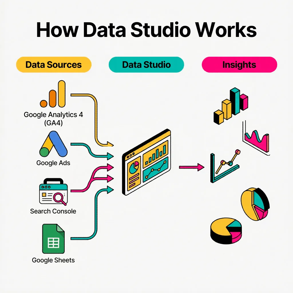
Google Data Studio is Google’s free reporting tool that lets you build interactive dashboards connected to live data. The core idea is straightforward: you connect your data sources (GA4, Google Ads, Search Console, Google Sheets, and more), build a dashboard once, and then it stays dynamic forever. You and your client can change date ranges, apply filters, and explore trends without anyone having to export a spreadsheet.
The tool sits inside the Google ecosystem, which means native connectors for the platforms most marketing teams already use are included at no cost. For non-Google platforms like Meta, LinkedIn, or Shopify, paid third-party connectors exist (more on those in Step 1).
What Google Data Studio gives you as a reporting layer:
– You choose what to show: metrics, dimensions, charts, and KPIs
– You choose how to show it: tables, time series, scorecards, bar charts, maps, and more
– You choose how people interact with it: date pickers, dropdown filters, drill-downs, and search boxes
– You share it like a Google Doc: view access for clients, edit access for your team
The real advantage comes with client retention. If you keep a client for months (or years), Google Data Studio becomes deeply worth it: you invest time once, and each weekly or monthly report becomes an always-ready dashboard we can review live with the client during meetings, rather than a repetitive cycle of downloading from platform A, reformatting in Sheets, and pasting into slides. Think of it like a chess opening: the setup takes thought, but it defines whether the rest of the game runs smoothly.
Most Google Data Studio dashboards turn into a mess for one simple reason: people start with charts instead of questions. If you spend 10 minutes deciding what the dashboard is for before opening the tool, you will save yourself days of rework later.
Before touching Google Data Studio, lock in five basics:
– Who is it for? Internal team dashboards can be messy-but-useful. Client dashboards must be clean, scannable, and explainable in a 15-minute call.
– What decisions should it support? Budget shifts, SEO priorities, lead quality checks, ecommerce performance. Pick the real “so what” for each page.
– What is the minimum KPI set? If you cannot explain why a metric is there, it is probably noise. Classic example: “bounce rate was weird in August.”
– How often will it be used? Weekly dashboards need fast signals. Monthly dashboards need stable trends and context.
– Which time comparisons matter? Month-over-month, year-over-year, last 7 days vs previous 7 days. Choose what actually matches the business rhythm.
If you are new to the tool, these six terms will come up constantly. Getting them right from the start prevents a lot of confusion later.
– Data source: where the data comes from (GA4, Google Ads, Search Console, Google Sheets, or a third-party connector)
– Dimension: a category or label that describes your data (campaign name, source/medium, country, page path, search query)
– Metric: a number that measures something (sessions, clicks, cost, conversions, revenue, ROAS)
– Chart: the visual element that displays your data (table, time series, scorecard, bar chart, pie chart, map)
– Control: an interactive filter your viewers use (date range picker, dropdown list, search box)
– Calculated field: a custom metric built from a formula, like a spreadsheet function (AOV, CPA, MER, conversion rate)
– Blend data: a way to combine fields from multiple sources into one chart (powerful, and also the part that gets complicated fast)
Understanding the dimension/metric split is especially important. Dimensions describe; metrics measure. When something looks “off” in a chart, it is almost always because a metric is being grouped by the wrong dimension.
You can add connectors in two moments: when you first create the report (Google Data Studio will prompt you immediately), or later via Resources > Manage added data sources > Add a data source. Both paths lead to the same connector library.
For most teams, the native Google connectors are enough to build a solid first version. Connecting Google Analytics 4 with Google Data Studio gives you session, user, and conversion data. Connecting Google Ads to Google Data Studio adds cost, impressions, clicks, and ROAS. Google Search Console to Google Data Studio brings in organic search impressions, clicks, CTR, and average position. Connecting Google Sheets to Google Data Studio is the most flexible option, since a Sheet can hold almost anything.
When you need non-Google platforms (Meta, LinkedIn, Shopify, HubSpot, and so on), you will typically use a partner connector. Supermetrics and Power My Analytics are the most common choices, though both come with a subscription cost.
The workaround I use constantly to save money: if you want to avoid paid connectors (or reduce them), Google Sheets is your safety net. Export data into a Sheet (manually or via a Zapier/Make automation), connect Google Data Studio to that Sheet for free, and build your dashboard on top of it. It is not as clean as a direct connector, but it works. For many teams, it is the difference between “we can do this” and “the budget says no.”
Once your sources are connected, you start building from Add a chart. A structure that works reliably across most projects follows three layers: top KPIs, trends, and investigation.
Start with a small row of scorecards that map directly to the dashboard’s purpose. For SEO it is usually clicks, impressions, CTR, and average position. For paid media it is cost, conversions, CPA, and ROAS. For a GA4 overview it is users or sessions plus the one outcome you care about most. Adding comparison periods (month-over-month, year-over-year) to scorecards can be helpful, but if you add them everywhere the page becomes visually noisy. Use comparisons only where they answer a real question.
Then add one clean time series per theme. The goal is to answer “is it going up or down?” at a glance. If a viewer needs five minutes to decode a chart with ten overlapping lines, it is not doing its job. One line per chart, labeled clearly.
Finally, include one or two tables for investigation. This is where viewers go from “I see the trend” to “I understand why.” Tables become genuinely powerful once you add sorting and interactive controls, because the viewer can explore without asking you for a new screenshot. Useful dimensions for tables: campaigns, landing pages, search queries, device category, and (where geography matters) country or city.
Interactivity is not a nice extra; it is the point. A static PDF tells people what happened. An interactive dashboard lets people ask their own follow-up questions. That is where the real value lies, and it is what justifies calling it a “live” report.
A date range control should be on every report. Place it near the top and link it to all charts that should respond to it. One important mechanic to understand: charts set to “Auto date range” will follow the control, while charts with a fixed date range will ignore it. This is actually useful when you want elements like “month-to-date pacing” that stay fixed regardless of what the viewer selects.
After the date range, add two to four dropdown controls that reflect how your audience actually explores data. Campaign name, country, device category, source/medium, landing page, and search query (for Search Console) are the most common choices. If your naming conventions are consistent, the advanced filter control with “contains” or “starts with” logic becomes very efficient for slicing quickly. For example, “NA_” to filter North American campaigns, “Brand” to isolate branded traffic, or “/blog/” to see only blog traffic.
Cross-filtering is another powerful feature: when a viewer clicks a bar in a chart, it can automatically filter all other charts on the page to match. Enable it selectively. On a well-structured page it feels natural. On an overloaded page it creates confusion.
The simplest way to stay sane is to remember: dimensions describe, metrics measure. Dimensions are the “who, what, where” (campaign, device, country). Metrics are the “how much, how many” (cost, revenue, sessions, ROAS). When something feels “off” in a chart, check this relationship first.
A common friction point comes when you need a count derived from a dimension. For example, “how many distinct cities drove traffic this month?” That is not a raw metric; it is a calculated one. In Google Data Studio, you handle it with a calculated field using `COUNT_DISTINCT(City)`. Totally normal and easy to set up once you know where to look (inside the data source or directly inside a chart’s field editor).
Another frequent confusion: date dimensions. Google Data Studio offers multiple date formats (Date, Week, Month, Quarter, Year). Make sure your time series charts use the right granularity for the reporting period. A daily chart on a 12-month view is unreadable; switch to Month for trends and keep daily only for short windows.
Calculated fields are one of the most useful features in Google Data Studio, especially when you need consistent KPIs across multiple charts and pages. You can create them inside a single chart (local scope) or at the data source level (global scope). If you will reuse a KPI in more than one place, always create it at the data source level. Otherwise you end up duplicating formulas across charts and eventually lose track of which version is correct.
The most common calculated fields you will actually build and use on real projects:
– AOV: `SUM(Revenue) / SUM(Transactions)`
– Conversion rate: `SUM(Conversions) / SUM(Clicks)`
– CPA: `SUM(Cost) / SUM(Conversions)`
– MER (Marketing Efficiency Ratio): `SUM(Revenue) / SUM(Cost)`
– CTR: `SUM(Clicks) / SUM(Impressions)`
– Drop-off rate: `1 – (SUM(Step_B) / SUM(Step_A))`
Google Data Studio formulas feel similar to spreadsheet logic, with one difference: you do not start with `=`. You just write the function directly. If you come from Google Sheets, the learning curve is minimal. The function library is smaller than BigQuery SQL but more than enough for 95% of reporting needs.
One naming tip that saves a lot of confusion: give your calculated fields descriptive names that include the source platform. “Google Ads Cost” is clearer than “Cost” when your report blends multiple sources.
Google Data Studio is not a design tool, and trying to make it one is a trap I have seen many teams fall into. Design in a reporting context should improve clarity, not impress. A beautiful dashboard that takes five seconds to load and requires a scroll map to navigate is worse than a plain one that answers questions in ten seconds.
A layout that scales reliably is boring in the best way: a simple header (logo and report title), a neutral or white background, consistent spacing between elements, and clear “sections” or visual groupings by topic. Avoid mixing too many chart types on a single page. Consistency builds trust. A viewer who has to re-orient themselves every time they switch pages will stop using the dashboard.
Do not be afraid of multiple pages. A report with four focused pages (Overview, Paid Ads, SEO, Ecommerce) often loads faster and navigates more cleanly than a single monster page with 20 charts. Each page answers one set of questions.
If you need quick branding, Themes are a shortcut worth knowing. Go to Theme and Layout > Extract theme from image and upload a brand slide or color palette screenshot. The result is not perfect, but it gives you consistent colors across all charts in a few seconds. For client work, this small touch goes a long way.
Once you build one good dashboard for a client, you should almost never start from scratch again, since you already have a good template.
The workflow is straightforward: build one template report with placeholder data sources (a “template GA4,” a “template Google Ads account”), then go to File > Make a copy when onboarding a new client. During the copy process, Google Data Studio gives you a screen to remap each data source: template GA4 becomes Client A’s GA4, template Ads becomes Client A’s Ads account.
You will occasionally need small fixes after remapping. Connectors sometimes name fields differently (for example, “ROAS” in one account might be called “Return on ad spend” in another), and any calculated fields that reference those field names will break. Keep a short checklist of the fields your template relies on and verify them after each remap. With this habit in place, onboarding a new client dashboard goes from a two-day project to a two-hour one.
Over time, invest in a template library: one for ecommerce (GA4 plus Ads plus Shopify via Sheets), one for SEO clients (Search Console plus GA4), one for lead gen. Each template becomes sharper with every client you apply it to.
Blending is how you combine multiple data sources into a single chart, which is essential when you need cross-platform KPIs. The most common use case for ecommerce teams is calculating MER (Marketing Efficiency Ratio): total ad spend from Google Ads, Bing Ads, Meta Ads and other channels combined with total revenue from GA4 or Shopify.
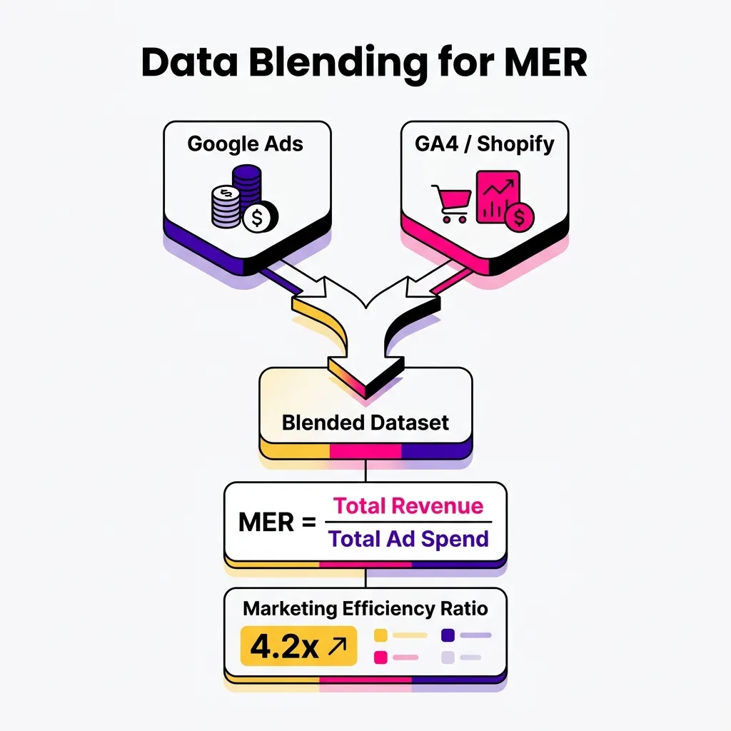
A simple, practical pattern for blending: build a chart from source A, build a chart from source B, multi-select both, then click Blend data, and add only the fields you genuinely need. Start minimal. It is much easier to add fields later than to untangle a blend with 15 dimensions and wonder why the totals do not match.
The main habit that prevents most blending headaches: rename all blended fields with the source platform name. If you keep generic labels like “Cost” and “Revenue,” you will end up with “Cost (Table 1)” vs “Cost (Table 2)” and lose track of which is which. Use names like “Google Ads Cost,” “Meta Cost,” “GA4 Revenue,” “Shopify Revenue” from the start.
One important limitation to know upfront: blending works well for totals and ratios, but it often breaks down when you try to join data at a granular level (like matching campaign names across platforms). When you need proper joins, the right solution is to unify the data upstream, in a Google Sheet or BigQuery, and then connect Google Data Studio to that single clean dataset. For deep-dive unified reporting across platforms, this upstream approach is reliable. For top-line MER and ROAS in a client overview, blending is fast and good enough.
Sharing in Google Data Studio works like Google Drive: you can give someone view access (fully interactive, no editing rights) or editor access (can modify charts and data sources). For client-facing reports, view access is almost always the right choice. Clients explore the data interactively; they do not need to accidentally delete a chart.
For reporting workflows, pick the format based on what the client actually does with it. A shareable link is best when clients want to explore current data on their own schedule. A PDF export is useful when a client needs a static “monthly file” they can forward internally, but remember that all interactivity disappears in a PDF. Set your date range and any relevant filters before exporting, otherwise the PDF will show whatever default state the report was in when you clicked export.
One useful permission detail: if you want viewers to explore data without seeing the underlying data source configurations, Google Data Studio handles this cleanly through view-only access. Viewers can interact with all controls (date pickers, dropdowns, filters) but cannot access the data source settings or edit any chart.
| Sharing Format | Best For | Interactivity | Always Up-to-Date |
|---|---|---|---|
| Shareable Link | Ongoing client reporting, self-serve exploration | Full (filters, date pickers) | Yes |
| PDF Export | Monthly recap, stakeholder presentations | None (static) | No (snapshot) |
| Scheduled Email | Automated recurring delivery (PDF) | None (static) | At time of send |
The highest-value dashboards are not the prettiest. They are the ones that answer the right questions for the right audience, consistently and reliably.
Client reporting is the most common use case, and the principle is simple: keep it predictable. A small KPI overview at the top, two or three trend charts in the middle, and one investigation table at the bottom. Commentary and interpretation happen in the call, not inside the dashboard. The dashboard is the data layer; you are the analysis layer.
Internal audit dashboards are one of the highest ROI things you can build in Google Data Studio. You can monitor QA signals that would be painful to check manually: 404 pages, duplicate page titles, UTM parameter anomalies, traffic spikes from suspicious sources. Build the template once and deploy it across all properties. Each new property takes an hour to onboard. If you manage ten clients, that template alone saves dozens of hours per year.
Ecommerce funnel monitoring does not require a fancy analytics setup to be useful. Four scorecards (product views, add-to-cart, checkout, purchase) with calculated drop-off rates between each step, updated daily, give your team a clear enough signal to act. If you want to go deeper into funnel analysis, our Black Friday ecommerce strategy post covers how we set up GA4 funnel reports for peak-period monitoring. Not glamorous, but fast and effective.
At Midsummer, most of our client dashboards follow a standard structure we have refined across dozens of accounts: a clean overview page with top KPIs, then channel-specific pages (Paid Search, Paid Social, Organic) depending on the channel mix. Each page is designed to answer one set of questions without requiring navigation between pages.
The most common mistake I see (and that we help clients fix) is dashboard overload: too many charts on a single page, too many metrics per chart, and no clear hierarchy of what matters most. The result is a dashboard that nobody opens after the first week because it feels like work to interpret.
Our approach at Midsummer starts with the question: “What decision does this dashboard need to support?” Once that is clear, everything that does not serve that decision gets removed. A lean dashboard that gets checked every week is worth 10 times more than a comprehensive one that nobody uses.
We also use Google Data Studio as a QA layer during campaign setup. Before a campaign goes live, we build a quick-check view connected to the live data source so we can verify that tracking is firing correctly, that UTM parameters are intact, and that conversions are recording as expected. Catching a tracking error in week one versus discovering it in the monthly report is the difference between a fixable problem and a lost month of data. If you are setting up Google Ads conversion tracking for Shopify, our guide on Google Ads conversion tracking for Shopify walks through the full setup step by step. For teams who want to track AI Overview clicks in GA4, we have a detailed setup guide for that too.
Use this checklist when reviewing any dashboard before sharing it with a client or stakeholder.
Dashboard structure
– ✅ One theme per page (Overview / Paid Ads / SEO / Ecommerce)
– ✅ Top KPIs visible without scrolling
– ✅ Fewer charts with clearer purpose, not more charts with ambiguous purpose
– ✅ Tables for investigation, not 12 micro-charts
Interactivity
– ✅ Date range control on every page
– ✅ Two to four meaningful filters (campaign, country, device, source)
– ✅ “Contains” filters where naming conventions are consistent
Calculated fields
– ✅ Reusable KPIs (AOV, MER, CPA) defined at the data source level
– ✅ Fields named with the platform source for clarity
– ✅ Formulas documented in the field description field
Blending
– ✅ Blends used primarily for totals and ratios (MER, blended ROAS)
– ✅ All blended fields renamed with platform prefix
– ✅ Complex joins handled upstream in Sheets or BigQuery, not in Google Data Studio
Performance
– ✅ Heavy dashboards split across multiple pages
– ✅ No more than three or four blended sources per page
– ✅ Date ranges tested on slow connections before sharing with clients
Google Data Studio is a free, web-based reporting tool that connects to data sources like GA4, Google Ads, and Google Sheets to create interactive, shareable dashboards. It was previously called Google Data Studio and was rebranded in 2022.
For native Google data sources (GA4, Google Ads, Search Console, Google Sheets, BigQuery), yes. For non-Google platforms like Meta, LinkedIn, or Shopify, you typically need a paid third-party connector such as Supermetrics or Power My Analytics, unless you route the data through a Google Sheet first.
Go to your Google Data Studio report, click Add data, and search for “Google Analytics.” Select your GA4 property from the list. The native connector is free and includes all standard GA4 dimensions and metrics, including custom events and conversions you have configured in your property.
Same process: click Add data, search “Google Ads,” and select the account you want. You will need editor or admin access to the Google Ads account to connect it. Once connected, all standard campaign, ad group, keyword, and creative metrics are available.
Add data > Google Search Console > select your property. You get two table types: Site Impression (top-line data) and URL Impression (page-level data). For most SEO dashboards, URL Impression is more useful because it lets you break down by landing page and query.
You can add text boxes, but they are static. If the viewer changes the date range, your commentary will no longer match the data they are seeing. A common workaround is to keep structured notes in a Google Sheet and display them conditionally, or to write commentary in a separate recap document shared alongside the dashboard link.
Yes, and it is one of the highest-leverage habits for any agency. Build the template with placeholder data sources, then use File > Make a copy to remap sources for each new client. Expect occasional field name differences between accounts and keep a short checklist to verify after each remap.
Blends in Google Data Studio do not behave like a clean SQL join, especially when you mix dimensions from different platforms. For totals and ratios (MER, blended cost, blended revenue), blending works well. For granular joins at the campaign or keyword level across platforms, consolidate data upstream in a Google Sheet or BigQuery first, then connect Looker Studio to that single unified dataset.
Have a specific Google Data Studio setup question? Reach out to the Midsummer team. We are happy to take a look.