There’s a certain magic to the best product pages on the web. When you arrive on one, everything just feels right: from the stunning visuals to the perfectly worded copy and those intuitive buttons that seem to whisper “buy me”.
This magic isn’t luck; it’s the result of deliberate, strategic product page optimization. It’s about turning casual browsers into excited buyers, and ultimately, turning your traffic into revenue.
At Midsummer Agency, I’ve seen firsthand how the power of product page optimization can transform an e-commerce business.
You can have the most dazzling search campaigns, the trendiest social media campaigns, and the best SEO strategies, but if your product pages aren’t optimized, you’re watching those precious visitors slip through your fingers.
The product page isn’t just another web page. It’s the stage where all your marketing efforts meet conversion. And it deserves your absolute focus, especially if you’re spending +$50.000 in advertising budget per month, with most traffic directing to, you guessed it, your product pages.
Let me take you through why every detail on your product page matters, how to think about each element like a marketer and a shopper combined, and how to craft pages that not only look great but actually make people want to click “Add to Cart”.
The Heart of E-Commerce: Why Your Product Page Deserves Your Full Attention
Imagine your website as a beautiful boutique. You’ve put so much thought into the window display: those ads and SEO efforts bringing people inside. But the real test is on the shelves: if your product displays are messy, unclear, or uninspiring, shoppers will hesitate or leave empty-handed.
Online, your product page is that shelf. It’s where visitors decide whether to buy or bounce. Unlike a physical store, you don’t have a salesperson to guide hesitant buyers, answer questions, or build trust in person. The product page has to do all of that, digitally and instantly.
And this isn’t just theory: we’ve seen brands transform from barely breaking even to thriving simply by fixing their product pages. Even small changes – a clearer button, sharper images, better copy – can double (if not way more) conversion rates. This is the kind of impact that changes the game.
Starting with a Clear Goal: What Does Success Look Like?
Before diving into changes, it’s essential to clarify your goal for the product page. Most of the time, it is simple: get visitors to add products to their cart and complete a purchase. But sometimes, it’s more nuanced when you have an ecommerce that treats both B2B as well as B2C pages, for example.
In other cases, some brands want to encourage newsletter signups or product trials as micro-conversions that build toward a bigger sale later. Others might focus on driving subscriptions or gathering product reviews.
Defining a goal sharpens your focus. It shapes what you test, what you prioritize, and how you measure success. If your goal is purchase, you might prioritize checkout simplicity and trust signals. If it’s subscriptions, you’ll highlight recurring benefits and savings.
Analytics are your friend here. Dive into data to understand which product pages get traffic and where users drop off. This way, you focus your optimization efforts on pages that offer the biggest potential lift. It’s not guesswork; it’s smart prioritization. Learn more about what analytics is and why it’s important.
1. Crafting Product Titles That Spark Clearly and Sell Smartly
When a shopper lands on a product page, the product title is often the first textual cue they read after the images. This isn’t just a label; it’s a headline, a promise, and a clue to what lies ahead.
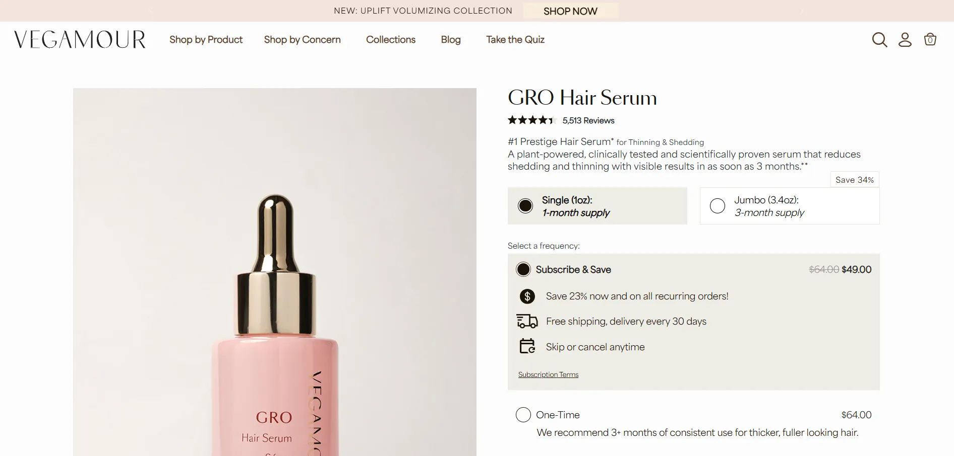
Many brands overlook the power of a good product title. A vague or confusing title like “GRO” might mean something internally, but for a shopper, it says nothing about what they’re actually looking at. Contrast that with “GRO Hair Serum” which instantly conveys what the product is. It could also be a little more detailed in my opinion, but the important thing is that the essence of the product is understandable.
Example of an optimized product page title.
A great product title does three things:
it clearly describes the product
it includes keywords shoppers use when searching (which helps SEO)
it builds trust by reducing confusion.
Shoppers want to feel confident they know exactly what they’re buying.
There’s also an art to balancing clarity with brand voice. You want the title to feel authentic, not robotic or too clinical, but never sacrifice understanding for creativity. Your title should make the shopper say “Yes, that’s exactly what I’m looking for.”
2. The Visual Story: Why Product Images Are Your Best Salespeople
If words convince the brain, images convince the heart. High-quality product photos do more than just show the product; they inspire desire, build trust, and reduce hesitation.
Think about the last time you shopped in a physical store: you pick up the product, look at it from all angles, maybe open it up or feel its texture. Online, your images have to do all of that work for you. They act as a window into the product’s essence, creating a connection with the shopper in the absence of touch and feel.
Each image has a role:
The pack shot: a clean image of the product packaging reassures shoppers about what they’ll receive.
Lifestyle images: show the product in action or in context, helping shoppers envision how it fits their lives.
Close-ups: highlight textures, ingredients, or unique features – this is particularly important for products like skincare or gourmet food.
Consistency is key here. When images vary too much in style or size, it can create a chaotic user experience that shakes confidence. A well-organized gallery with consistent lighting, backgrounds, and sizing tells shoppers that your brand is polished and professional. It communicates that you care about the details, which builds trust – and trust is the gateway to conversion.
3. Product Videos Build Trust and Drive Conversions
While product images play a huge role in sparking desire and providing essential details, video takes the product experience to a whole new level. When it comes to building trust and overcoming hesitation, video can demonstrate the product in ways that static images simply cannot.
Seeing a product being demonstrated, applied, or modeled builds an extra layer of confidence in the buyer’s mind. Imagine a beauty product: a video showing a model applying the product to her skin not only shows the texture and how it’s used but also helps the viewer connect emotionally. This sense of “I can see how this works” is a powerful trigger for conversion.
In my experience, adding even a short “how-to” or demonstration video to a product page can be a game-changer. I worked with a beauty brand that incorporated a quick application tutorial on their product pages, and it resulted in a 20% lift in conversions almost overnight. It wasn’t just about showing the product – it was about creating an experience and offering the customer a chance to imagine themselves using it, which directly influenced their decision to purchase.
4. The Power of a Sticky “Add to Cart” Button
Picture this: you’re browsing through a product page on your phone. You get to the bottom, ready to take action, but the “Add to Cart” button is back at the top. Now, you have to scroll all the way back up. It’s a small frustration, but it can easily cause many users to abandon the page altogether.
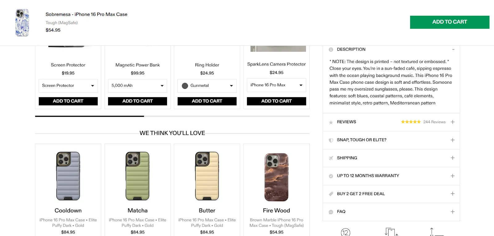
This is where a sticky “Add to Cart” button becomes your unsung hero. It stays visible as users scroll, ensuring the call to action is always within reach. Not only does this make the purchase path more convenient, but the best sticky buttons also display the product thumbnail and name. This keeps the item top of mind without being too intrusive and it’s like a gentle nudge that reminds users exactly what they were interested in.
For mobile users, this feature is even more critical. Smaller screens mean less space and more effort to navigate. A sticky CTA button removes that barrier and makes the path to purchase smoother, keeping users engaged and making the process more intuitive.
At Hero Conf I talked about Fitts Law, a UX law that states that the closer and easier to perform an action, the easier it is to convert.
5. Breadcrumbs: A Simple Way to Guide Shoppers
Breadcrumb navigation is often an overlooked but powerful element of product page design. At its core, it’s about giving users a clear map of where they are on your site and how to get back.
It’s about reducing confusion and boosting confidence. When shoppers know they can easily return to the previous page or category, they feel more in control of their shopping experience.
Breadcrumbs are also a subtle but valuable tool for SEO. They help search engines understand your website structure and improve internal linking, potentially giving your product pages a slight boost in visibility.
While breadcrumbs may seem like a small feature, their cumulative impact on both user experience and SEO can be significant.
For mobile design, breadcrumbs become even more important. Limited screen space means you have less room for traditional navigation, so having this breadcrumb trail helps streamline the browsing process without overwhelming the user.
It’s a quiet guide that reassures customers and keeps them from getting lost.
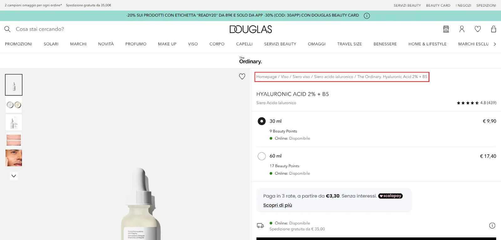
Douglas does a great job at adding clear and usable breadcrumbs on their product pages.
6. Trust Signals Are the Currency of Online Shopping
When customers shop in a physical store, they can inspect products, ask questions, and rely on staff. Online, trust has to be built through design and content. Without it, visitors hesitate.
Trust signals like security badges, money-back guarantees, free shipping promises, and accepted payment logos act as reassuring nods at the moment of decision. Our brains are wired to avoid risk, and these elements soothe that fear.
Placement is everything: these trust badges are most effective near the “Add to Cart” button or checkout prompts, moments when shoppers wrestle with hesitation.
Different product types demand different trust signals. High-ticket items like mattresses or electronics benefit from clear warranties and refund policies.
Beauty products might lean on ingredient transparency and certifications. Understanding your audience’s concerns helps you place the right signals.
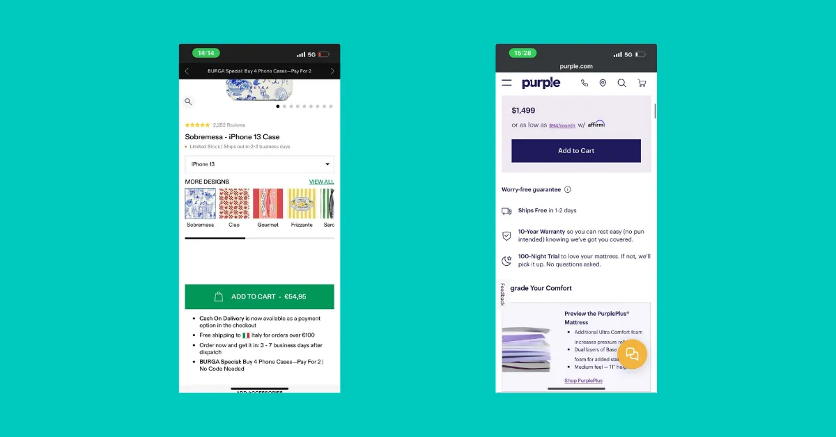
BURGA and Purple both have trust elements, even though they differ greatly. Purple focuses on more impactful trust elements, as the product is more expensive. BURGA on the other hand focuses on Cash on Delivery and Free shipping.
7. Writing Product Descriptions That Educate and Inspire
The product description is often underestimated. It’s your place to communicate value, answer questions, and overcome objections.
The best descriptions break information down into clear, digestible sections. Explain what the product is, who it is for, how to use it, and what makes it special. For example, ingredient lists and allergen info are essential in the beauty and food industries.
Descriptions that tell a story resonate most. Instead of listing features, explain benefits and experiences. Help shoppers picture how the product fits their life and solves their problems.
Design-wise, using tabs or accordions keeps the page tidy while making important info easy to find.
BURGA excels at presenting product descriptions and essential details. The copy is creatively written, and key information is neatly organized within an accordion for a clean, user-friendly experience.
8. Social Proof and Reviews: The Ultimate Conversion Boosters
Reviews are the digital equivalent of a trusted friend’s recommendation. They’re proof your product works and connects with real people. But not all reviews are created equal.
Shoppers trust detailed reviews with photos, verified purchase badges, and context like the reviewer’s age, skin type, or lifestyle. This helps users relate and envision how the product could fit into their own lives – without such context, it’s difficult to connect with others through a screen.
If your product is new and reviews are scarce, don’t hide them: show them proudly while working to collect more. Starting with a review platform like Judge.me or Loox sets you up for success.
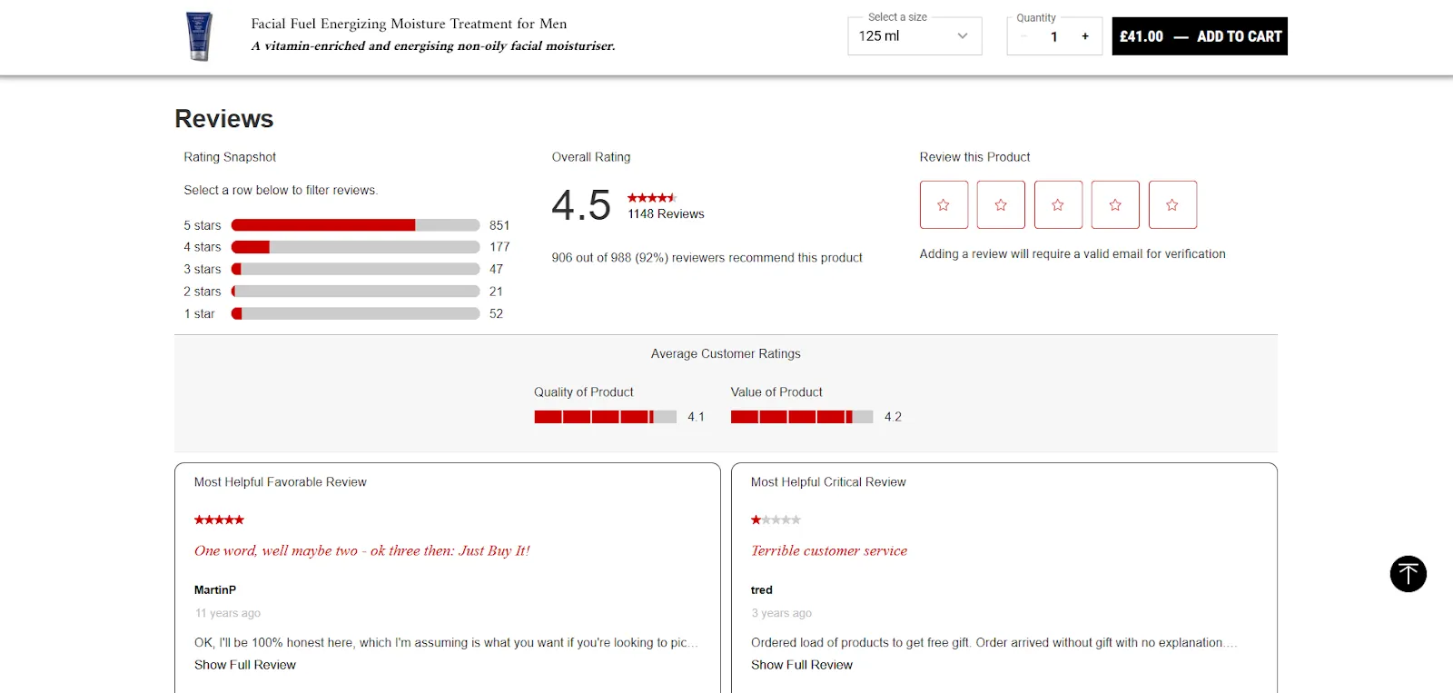
Kiehl’s reviews stand out by showcasing both the most helpful positive and critical reviews. Users can also search reviews by keyword and filter by rating or location.
9. Offering Smart Product Variants to Meet Every Shopper’s Need
Products rarely come in just one size or style. Think about it: whether it’s a pair of shoes, a beauty product, or even a bottle of wine, customers want options. Offering clear variant options such as sizes, colors, or scents ensures that shoppers can quickly find what they’re looking for.
When product variants are hidden or unclear, it often leads to confusion and frustration, which in turn can cause users to not add anything to their cart.
For example, if a shopper can’t immediately see that the product comes in different sizes or colors, they might assume it’s unavailable in the variation they want, and they’ll leave the page.
It’s essential to display these options prominently on the product page, ideally in a way that’s visually intuitive and easy to navigate. This improves the shopping experience, increases the likelihood of a conversion, and helps you cater to different customer preferences, ultimately increasing sales.
10. Boosting Average Order Value with Bundles and Cross-Sells
Now, let’s talk about how bundles and cross-selling can take your product pages to the next level. These tactics are key when it comes to boosting average order value (and ROAS or profit when running ppc campaigns!) and making the shopping experience feel more personalized.
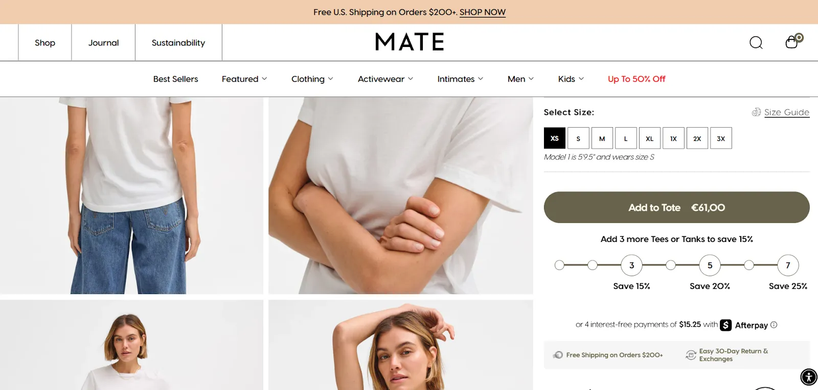
Take Mate The Label, for example. Their product page for the Organic Cotton Classic Tee offers a perfect example of how bundling can drive sales and increase average order value.
On their website, customers can choose to purchase a single tee, or they can grab multiple at a discounted price, encouraging them to buy more. The “Buy 2, Get 10% Off” (or a similar deal) is a clever strategy that taps into shoppers’ natural inclination to save money by buying in bulk.
MATE The Label sells premium organic cotton shirts, which can be a tough sell at a high price point. They cleverly offer bundles, giving users more value for less.
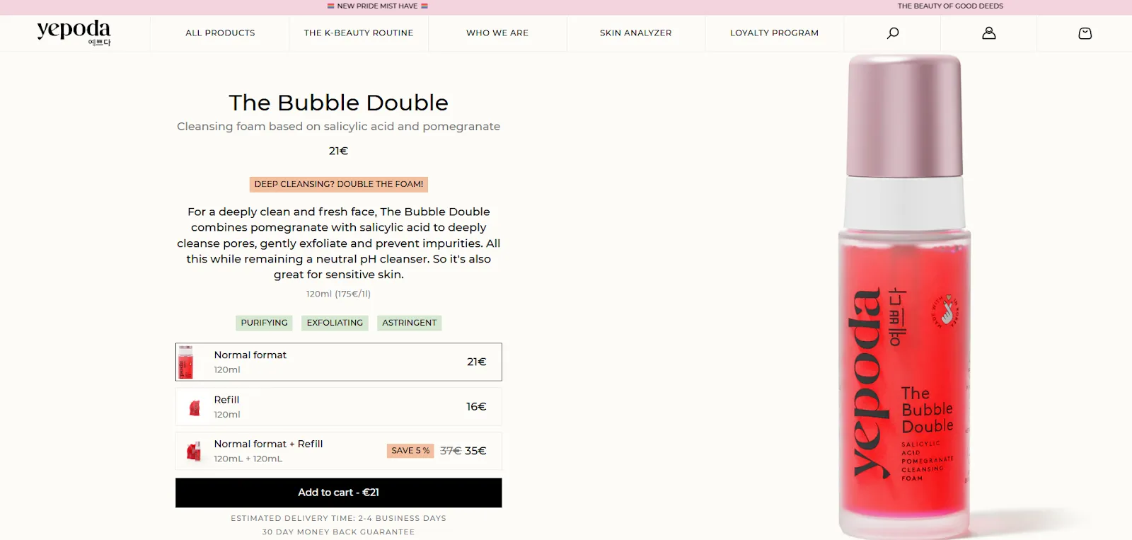
Yepoda takes a smart approach for skincare eCommerce by offering refills – same product, lower price. Ideal for returning customers, and even better when bundled for extra savings.
Cross-sells are equally important. When a customer is focused on one item, suggesting complementary products – like a face mask matching with the moisturizer they’re eyeing – encourages them to think about the broader experience. These offers should be presented thoughtfully to feel like value-adding suggestions rather than distractions.
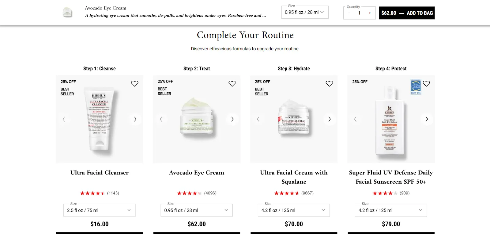
Kiehl’s nails cross-selling by recommending the full routine needed for optimal results.
The key here is relevance. Ensure that the items you suggest as part of a bundle or cross-sell make sense together. It’s not about bombarding customers with every possible product — it’s about enhancing their current decision with items they’ll genuinely appreciate.
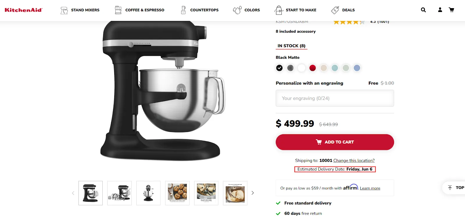
11. Provide Clarity with Estimated Delivery Dates
One of the major reasons shoppers abandon their carts is uncertainty around delivery dates and security. It’s a small detail, but it can make a big impact. Shoppers want to know exactly when their product will arrive, and not just a vague “shipping soon” message.
That’s why providing estimated delivery dates is such a powerful tactic. Displaying the expected delivery time clearly on the product page or during checkout reassures shoppers that they know when to expect their order. Adding countdown timers or “order within X hours” prompts can create a sense of urgency and push customers toward making that final purchase.
By providing this kind of transparency, you’re eliminating doubt and building trust. When customers feel confident about when they’ll get their product, they’re far less likely to hesitate or abandon their cart.
A product page displaying estimated delivery time near the add to cart button, a critical point.
12. Build Trust with Payment Security & Financing Options
Shoppers need to feel safe during checkout, and payment security is a huge factor in building that trust. Payment logos from trusted brands like PayPal, Visa, and Apple Pay act as digital reassurance that the transaction is secure. Seeing these familiar logos near the checkout button lets users know that their personal and financial information is in good hands.
For higher-priced items, you can also go the extra mile by highlighting financing options or payment plans. This gives shoppers more flexibility and reduces the hesitation that comes with a larger investment.
13. The Power of Customer Support: Tailor Your Options to Meet Shopper Expectations
Providing easy access to customer support, whether through live chat, email, phone support, or even WhatsApp, is an important trust signal. Shoppers feel more confident when they know help is readily available, especially during the checkout process (I beg you: do not cover your checkout button with a support option!). Quick, accessible support can be the final nudge that convinces a shopper to complete their order.
But offering the right kind of support is important. Depending on your audience, you may want to research which communication channels they prefer.
Some customers might prefer instant messaging like WhatsApp or live chat for quick answers, while others may be more comfortable reaching out via email or a contact page.
By understanding these preferences, you can provide a seamless support experience that aligns with your customers’ expectations, ultimately boosting conversions.
14. The Ongoing Journey: Testing, Learning, and Refining
Product page optimization isn’t a “set it and forget it” task. It requires continuous attention and experimentation to keep improving and adapting. In fact, I discussed the importance of testing in-depth during my presentation at AdWorld Experience, where I shared insights on how structured experimentation can drive significant improvements in conversion rates.
When traffic allows, A/B testing different headlines, images, layouts, and offers reveals what truly resonates with your audience. Testing allows you to make data-driven decisions rather than relying on assumptions, ensuring that your product pages are consistently optimized for performance.
For lower-traffic sites, where running A/B tests might not always be feasible, heuristic analysis, user feedback, and expert reviews help guide the improvements. These qualitative methods help identify areas for enhancement even without large-scale quantitative data.
At Midsummer, we blend data, creativity, and deep user empathy to keep optimizing and iterating. By continuously testing and learning from our results, we help brands grow sustainably, ensuring that every product page is functioning at its best.
Your Product Pages Can Shine Brighter Than Ever
Your product page is the grand finale of your digital marketing efforts. It’s where interest turns into action and browsers become brand fans. Every detail matters: from clear product titles to trust signals, compelling visuals, and easy checkout paths.
Optimized product pages don’t just increase sales. They build bright, seamless shopping experiences that keep customers coming back.If you want to make your product pages truly shine, Midsummer Agency is here to help. Let’s create pages that don’t just sell but delight your users. Want more information? Check out our conversion rate optimization services or contact us directly!