eCommerce Navigation Best Practices: How to Optimize UX & Boost Conversions
Why Navigation is Make-or-Break in Ecommerce Imagine walking into a beautifully designed store – gorgeous visuals, great products – but with no signage, confusing aisles, and…
Imagine walking into a beautifully designed store – gorgeous visuals, great products – but with no signage, confusing aisles, and no idea where to find the checkout. You’d likely leave, frustrated. That’s exactly what happens when users encounter poor ecommerce navigation.
Navigation is the silent guide behind every successful online journey. It doesn’t just help users find products; it helps them feel in control. It reduces bounce rates, improves engagement, and most importantly, boosts conversions.
At Midsummer Agency, we’ve worked with international ecommerce brands across fashion, luxury, and lifestyle, and we’ve seen firsthand how thoughtful navigation can drive major business results. In this guide, we’ll unpack the top ecommerce navigation best practices, including technical, strategic, and creative improvements to help your online store thrive.
1. Start with Clear, Intuitive Category Labels
The words you choose for your menu matter. Users rely on these labels to understand what your store offers at a glance. If labels are too abstract or clever, it forces them to think – and thinking leads to friction.
Instead, opt for simple, descriptive naming. When I was writing my thesis nearly a decade ago, I conducted information architecture research for a company in Malaysia. As part of the study, I interviewed active clients and ran a card sorting exercise to see how they would naturally organize the site’s content. The results were eye-opening: many of the existing menu labels were completely unclear to the very people using the site. It was a clear reminder that what makes sense internally doesn’t always translate to your users – and that clarity should always come first.
Why It Matters
Unclear labels confuse users and increase bounce rates. Clear labels reduce friction and support intuitive product discovery.
Best Practices:
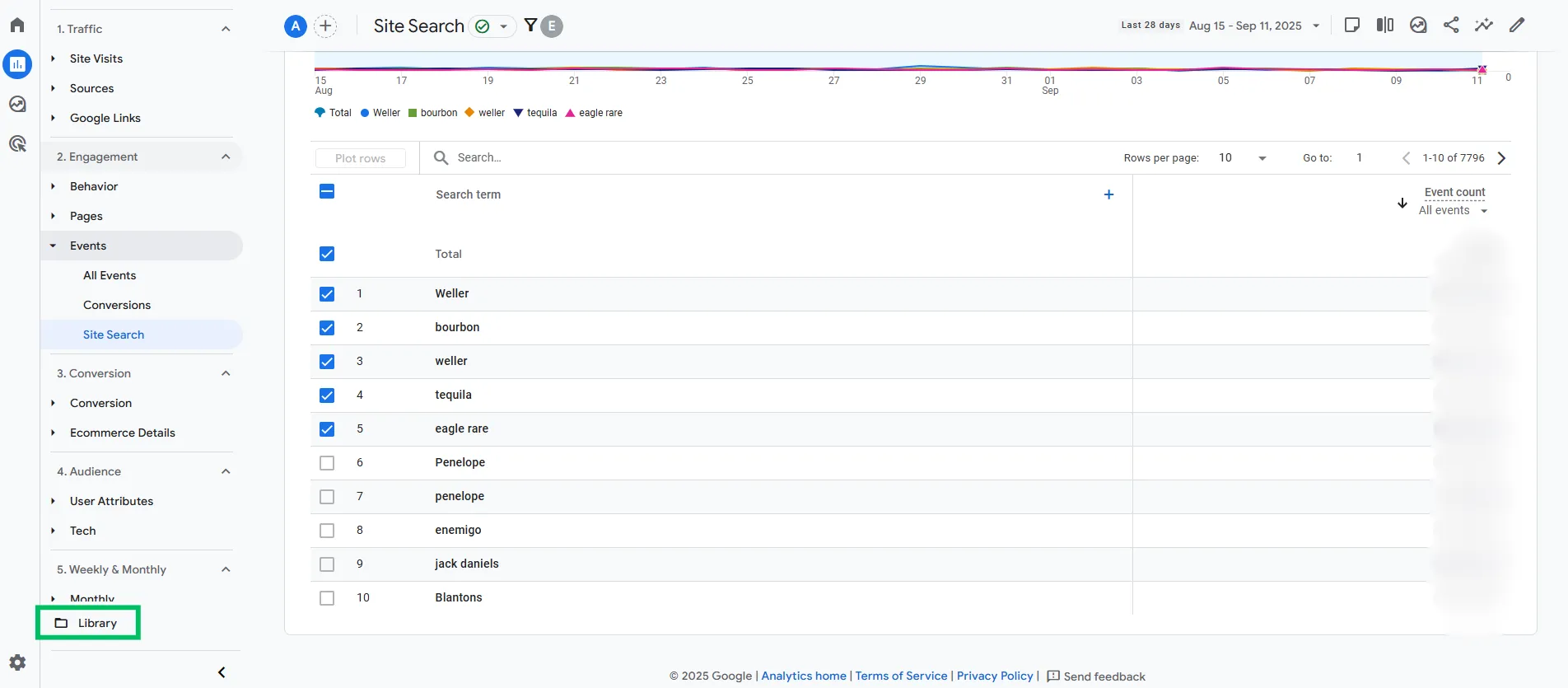
Use customer-centric language: draw from actual search data which you can find in GA4 or if you use an app on your website to improve search functionalities, look if they have data about user searches.
Avoid brand jargon or overly clever terms
Reflect category hierarchy with sub-labels like “Dresses > Summer Dresses”
Test new naming conventions via A/B testing or customer interviews
A good label meets a user where they are – in their mindset and language.
2. Keep Navigation Shallow and Broad
A good navigation structure resembles a well-organized shop floor. Users should be able to see the major sections and get where they need to go quickly – not get lost clicking through endless subcategories.
Of course this is not always possible: some stores (especially retail) are simply incredibly big. We are currently working on a BigCommerce store where things got out of hand: they have over 7.000 categories where a lot of the categories are simply duplicates. Users can’t even reach 95% of the categories. It’s terrible for UX, but also not great for SEO.
Ideal Structure
Keep your main menu broad (many top-level categories) and shallow (only 1–2 levels deep). For example:
The fewer clicks it takes to find a product, the higher the likelihood of a purchase.
Actionable Tips
Group items based on shopper intent (e.g., by occasion, budget, or style)
Eliminate redundant categories
Use analytics to determine which categories drive traffic and conversions
Broad-and-shallow navigation also benefits SEO by reducing page depth and improving internal link structure.
3. Use Sticky Navigation Wisely
Sticky elements are a UX favorite. They keep critical actions (like accessing the cart or searching) in reach as users scroll through product-heavy pages.
Benefits:
Keeps users oriented while they scroll
Encourages engagement with CTAs like “Shop Now” or “Add to Cart”
Reduces bounce rates on longer pages
Guidelines:
Ensure sticky headers don’t interfere with mobile browser navigation
Make sure sticky CTAs are responsive and not overlapping on small screens
On product pages, it’s generally better to prioritize sticky “Add to Cart” over search or menu.
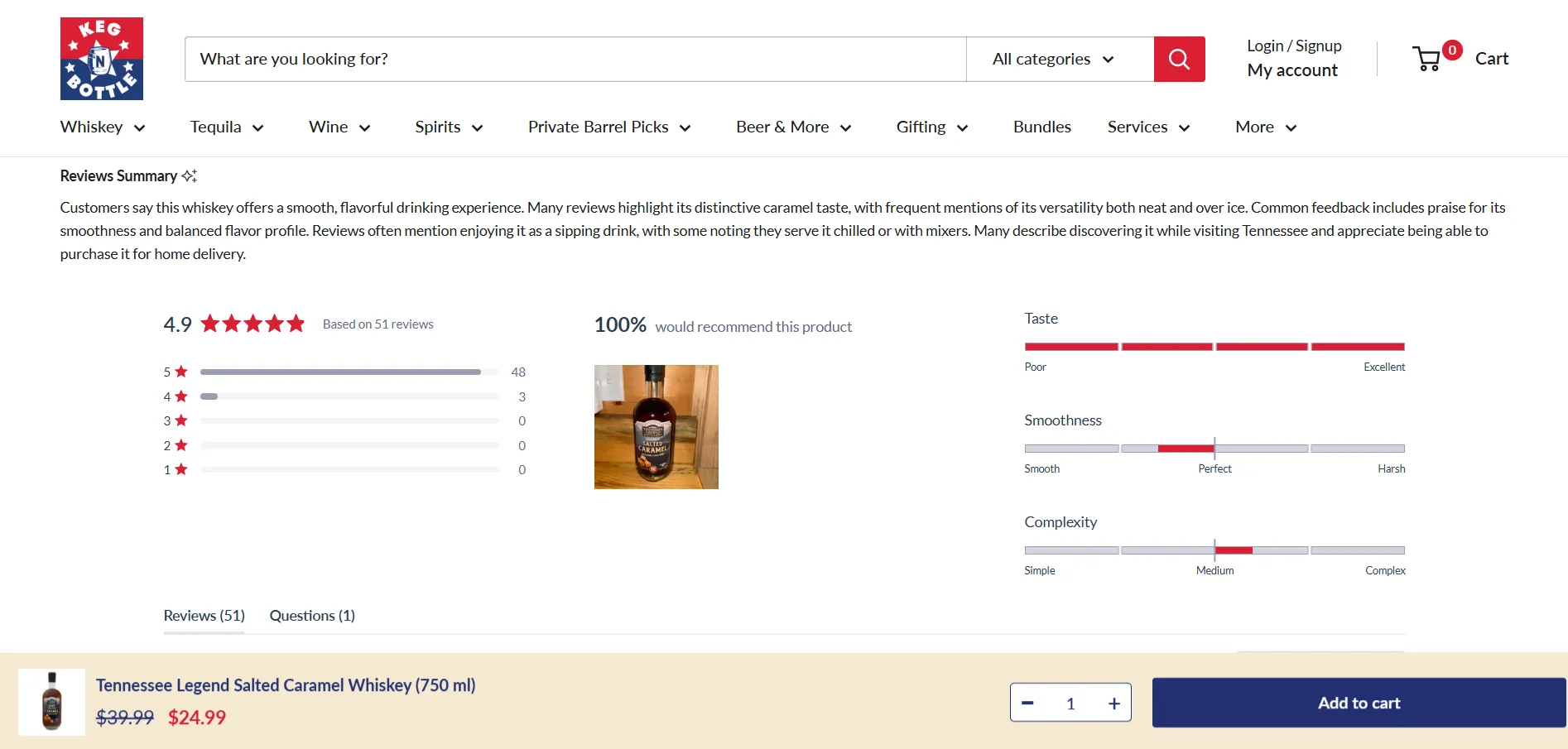
For our client Keg N Bottle we custom developed a sticky add to cart functionality on both desktop and mobile, that displays the product image, title, price, and quantity, so that users can immediately add their product to their cart without having to navigate up to the page to find the product information or atc button.
4. Prioritize Mobile Navigation Design
Mobile-first isn’t just a buzzword. In most ecommerce sectors, mobile traffic outweighs desktop.
Why Mobile Navigation Needs Special Attention
Limited space, finger-friendly UX, and vertical scrolling all mean your desktop solution won’t simply translate.
Mobile Best Practices:
Expose key category pages outside the hamburger menu (e.g., in a scrollable top bar)
Use icons + labels to make actions clear (e.g., 🛍️ Shop, 🔍 Search)
Ensure touch targets are large and well spaced
Keep performance smooth — no lag, sticky bugs, or accidental clicks
Pitfalls to Avoid:
Menus that collapse unintentionally
Hidden CTAs due to overlay conflicts
Buggy search that blocks interaction
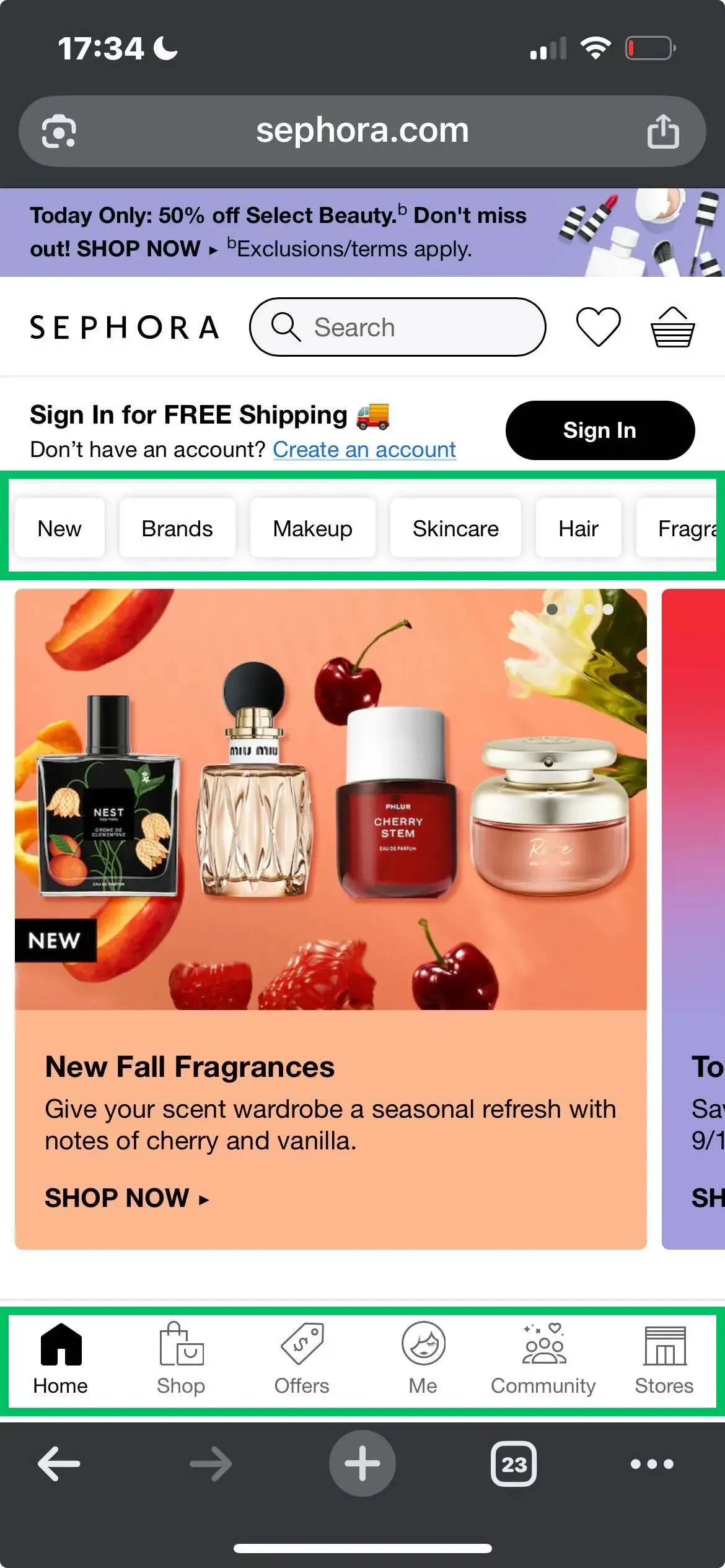
Sephora’s mobile design is a great out-of-the-box example: instead of relying on a hamburger menu, it uses intuitive sliders and persistent navigation, making it feel almost like an app. The search bar is also highly visible – a smart move, since users who search typically convert far better.
Sephora’s mobile navigation
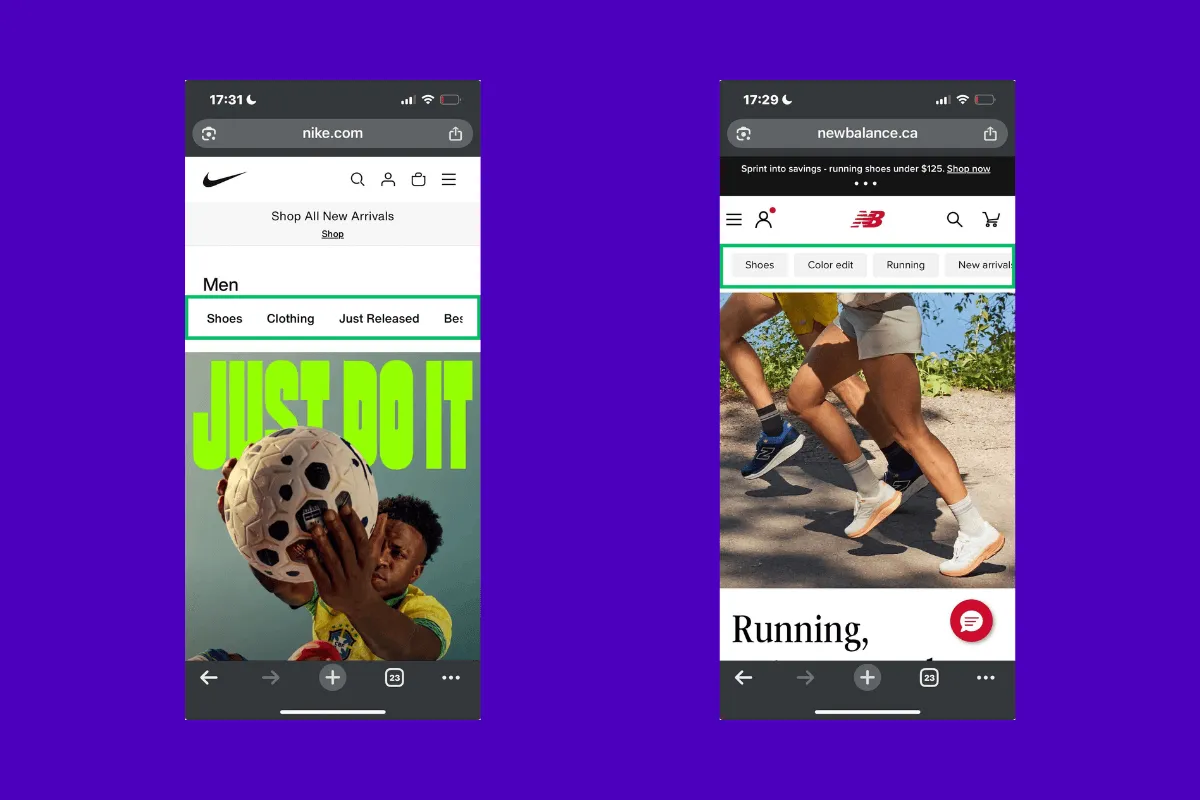
Nike and New Balance on the other hand also use persistent mobile navigation: they place the most important product categories outside of the hamburger menu, as sticky items that are easy to click on.
Nike & New Balance mobile navigation
My personal favorite? Sephora’s top menu design. The buttons are clear and easy to navigate – especially when compared to Nike’s. But as always in performance marketing, there’s only one real way to know what works best: A/B testing!
5. Use Data to Prioritize Navigation Items
Not all menu items are created equal. Your navigation should reflect the categories that drive the most revenue.
Data-Driven Menu Optimization:
Prioritize by conversion rate and AOV
Feature seasonal or high-margin collections
Eliminate low-performing links from the main nav
Tools to Use:
Google Analytics (CTR and revenue by menu click)
Microsoft Clarity (click maps and scroll depth)
Shopify Reports (sales by collection)
Of course, if your site has enough traffic to achieve statistical significance and you have the technical resources to support it, A/B testing your navigation menu is always the preferred approach. It provides concrete, data-backed insights that go beyond assumptions or analytics trends – so when possible, prioritize testing over relying solely on store metrics or behavior reports.
When it comes to Google Analytics data, we usually create a custom report in the Library section that highlights search terms along with the number of searches. This way, it’s immediately clear what users are typing into your site’s search bar.
Custom search term report in GA4
Of course, you need to make sure that you’re actually tracking the terms users are searching for, so you’ll have to reach out to your Analytics or Google Tag Manager expert to check if you can already track searches, or need to tweak something.
6. Show Location with Breadcrumbs
Breadcrumbs are simple and powerful.
They help users:
Know where they are on the site
Navigate back up the category tree
Understand product context
And they help search engines:
Understand internal hierarchy
Display breadcrumbs in SERPs
Best Practices:
Place breadcrumbs just under the header
Reflect full navigation path
Use structured data (JSON-LD) to optimize for SEO.
Mobile breadcrumbs often get removed or hidden. Make sure yours stay visible and usable. You won’t just help improve your user experience, you’ll also optimize your SEO.
7. Make Search Work Like Magic
For stores with more than a few dozen products, search is your user’s best friend. .
High-Converting Search Features:
Prominent placement (don’t bury it)
Autosuggest as the user types
Predictive results based on categories and products
Smart error tolerance (e.g., typo correction)
Search Page Essentials:
Filter and sort options
Visual hierarchy (featured vs. all results)
“Did you mean…” suggestions
Avoid search bars that remain sticky over “Add to Cart” buttons or take up too much space on mobile.
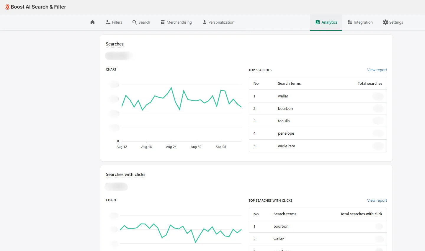
Boost AI Search & Filter is a great Shopify app for optimized navigation – they provide search that boosts sales with smarter search, personalized recommendations for those specific products that fit your need, product bundling, and merchandising tools. It’s all about showing relevant products when your users search!
If you use Shopify and use apps for optimized (AI) search tools, use their internal data to perfectionize your navigation menu.
8. Use Visual Cues in Mega Menus
When your menu has many categories, visuals help reduce overwhelm and direct attention.
Effective Visual Elements:
Icons for major categories (e.g., 👟 Shoes, 🎁 Gifts)
Thumbnail images in dropdowns
Highlighted promos or seasonal sections
Avoid overly decorative visuals. Everything should serve the purpose of helping the user navigate faster.
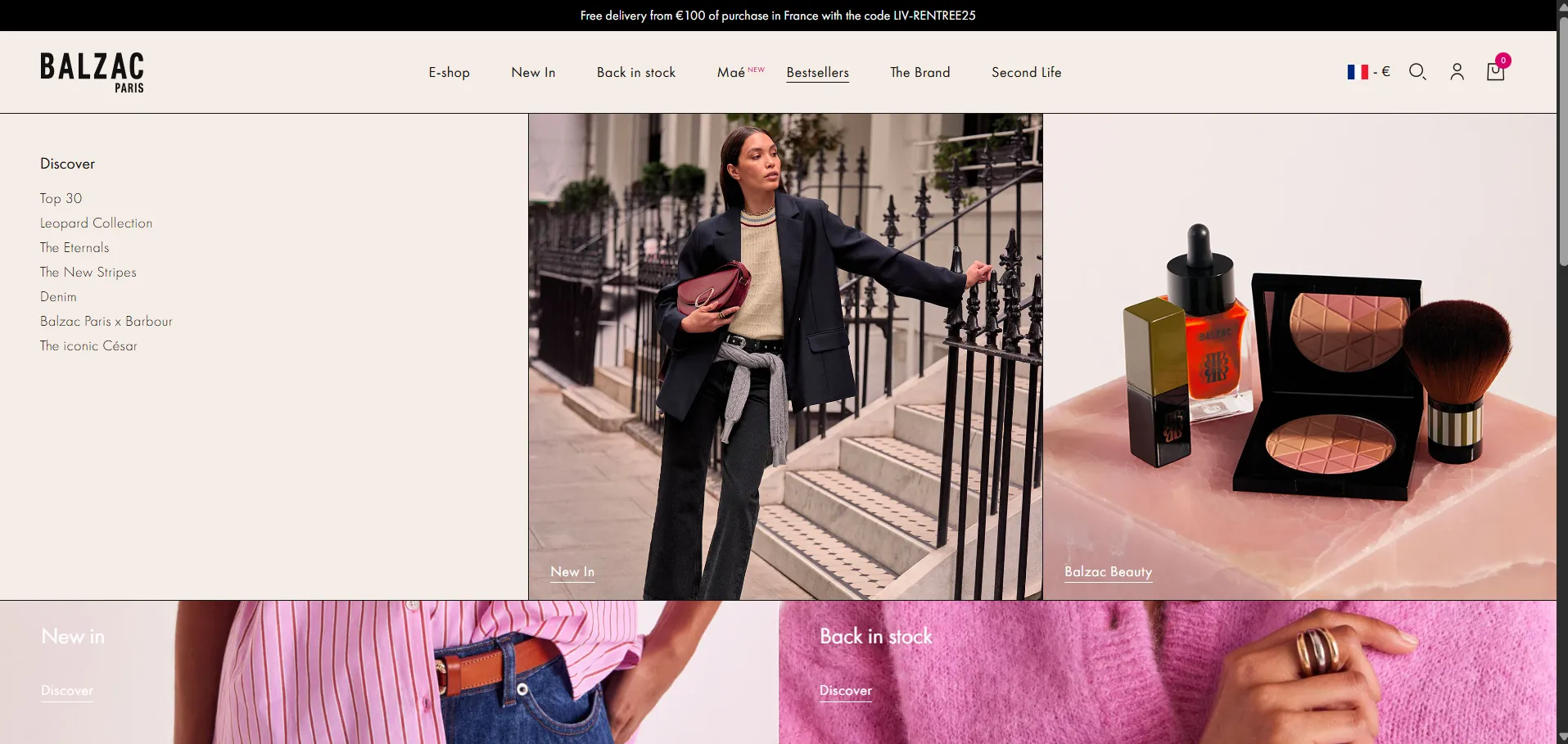
Balzac Paris uses the mega menu to highlight two important categories.
9. Streamline the Above-the-Fold Experience
The area users see without scrolling is prime real estate. Prioritize clarity over brand slogans.
What to Show:
Navigation (duh!)
Current offers or bestsellers
Easy access to categories
What to Avoid:
Corporate mission statements
Low-relevance info (e.g., “We deliver in San Diego” to a global user)
Consider dynamic content that adjusts by location – geolocation tech in Shopify makes this possible.
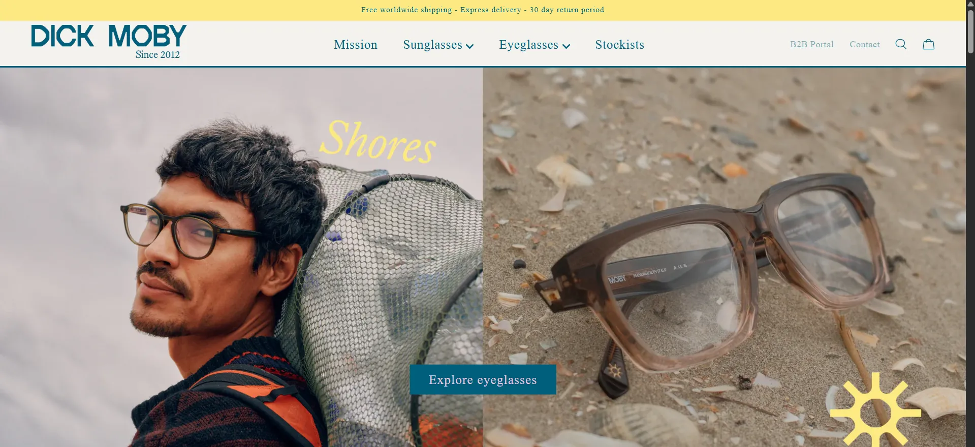
Dick Moby shows the glasses both in a close up, as well as on a model. They have a clear CTA that leads to their main category. Nothing fancy, but useful.
10. Eliminate Navigation Bugs
Even the best navigation design fails if bugs break it.
Bugs We’ve Fixed:
Duplicate category links
Sticky cart covering the nav bar
Breadcrumbs disappearing on mobile
Confusing icons (e.g., a gift box that’s actually a registry)
How to Spot Bugs:
Watch session recordings (Clarity, Hotjar)
Track rage clicks and exits on nav elements
Test across multiple devices regularly
Every fix reduces friction. Every reduction in friction = more conversions.
11. Optimize Navigation for AI Overview and SEO
Search engines now use structured content to summarize pages and generate AI-powered answers.
AI/SEO-Friendly Navigation Tips:
Use semantic HTML tags (<nav>, <ul>, etc.)
Label menu elements with aria attributes
Add schema.org BreadcrumbList to breadcrumbs
Avoid all-JS rendering for nav elements
Clean, structured, and crawlable = better visibility in search and AI Overview.
12. Test, Iterate, Improve
Your navigation is not a one-time project. It should evolve with your products, user behavior, and business goals.
What to Test:
Menu order and label clarity
CTA positioning
Sticky vs. static navigation
Search visibility and features
Tools to Use:
VWO (A/B testing)
GA4 (user pathing)
Hotjar or Clarity (user behavior)
Small wins stack up. Test, learn, and keep optimizing.
Final Thoughts: Navigation is the Unsung Hero of UX
When your navigation is clear, consistent, and user friendly, your users:
Find products faster
Explore more pages
Convert at higher rates
When it’s clunky or confusing? They bounce.
Navigation is one of the easiest ways to improve UX and conversions – and yet, it’s often the most neglected.
Ask yourself:
Can users find anything in 3 clicks?
Is it easy for mobile users to navigate?
Are top products visible right away?
If not, it’s time for a navigation upgrade.
At Midsummer Agency, we bring together data, design, and user psychology to build ecommerce sites that shine through our conversion rate optimization services.
Ready to optimize your site navigation? Let’s talk.