When it comes to running an online store, I often say your ecommerce category pages are like the welcome mat: the very first impression that sets the tone for your shopper’s experience. These pages aren’t just simple product lists; they’re your golden opportunity to guide visitors toward what they want in a way that feels effortless and enjoyable. If you get these pages right, you can dramatically boost your conversion rates and sales.
Over the years, I’ve reviewed tons of ecommerce sites, and I’ve learned a lot about what makes category pages truly effective. So today, I want to share with you my go-to best practices for ecommerce category pages – the advice I give clients when we’re aiming to turn casual browsers into happy buyers.
Understanding the Role of a Category Page
Let’s start at the beginning. What exactly is a category page? At its core, it’s a page that groups products into a meaningful collection, like “Men’s Running Shoes” or “Organic Skincare.” But it’s not just about grouping: it’s about creating a space where shoppers can easily find what fits their needs, quickly narrow down options, and feel confident in their choices.
In fact, I often think of category pages as the crossroads of an ecommerce site. They bring together discovery and decision-making. If a shopper can’t quickly understand what’s on offer or gets lost in a sea of products, they’ll likely leave. That’s why these pages need to be thoughtfully designed and optimized.
1. Clear Navigation: Your Shopper’s Compass
Before shoppers even land on your category page, navigation plays a huge role. I always encourage brands to keep their menus clean and straightforward. If a visitor has to dig through multiple layers just to find a category, they might give up before they even get there.
Organizing your categories logically helps too. For example, breaking down “Shoes” into “Running,” “Casual,” and “Formal” makes it easier for users to find what they want without being overwhelmed. This way, your category page feels like a welcoming entrance, not a maze.
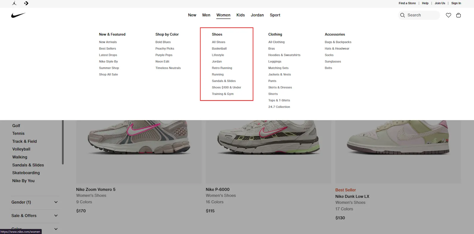
Nike organizes its top-level navigation starting with gender, then refines it further with options like color, shoe styles, clothing types, and additional filters.
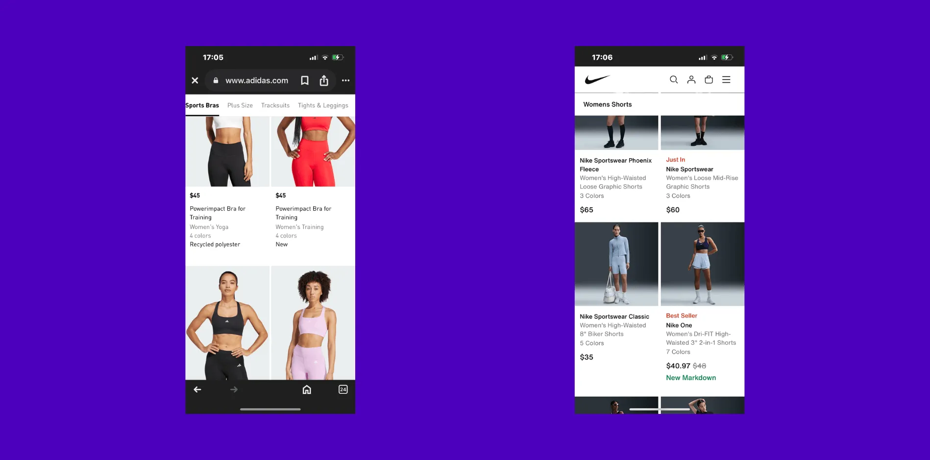
On mobile, it’s even more important to keep users oriented – your navigation bar should follow them as they scroll. This persistent nav helps users easily switch categories or return to a higher-level menu without friction, especially when attention spans are shorter and screen space is limited.
Adidas displays relevant category links directly in the navigation bar, avoiding the use of a hamburger menu. In contrast, Nike uses a full navigation bar but enhances the user experience by clearly indicating the category being browsed – for example, ‘Women’s Shorts’. Both interesting category nav bar tactics to test.
2. Filters and Sorting: The Secret Sauce for Finding Products
Now, when I look at a category page, one of the first things I check is whether there are filters or sorting options, and more importantly, how easy they are to use. For bigger catalogs, filters are a must-have. Without them, shoppers might feel lost or frustrated scrolling endlessly.
Filters let users refine by things like price, size, color, or rating – whatever matters for your products. But here’s the catch: filters need to work seamlessly on mobile. I’ve seen sites where filters look great on desktop but vanish or become impossible to use on a phone. Considering that most ecommerce traffic is mobile now, this is a huge missed opportunity.
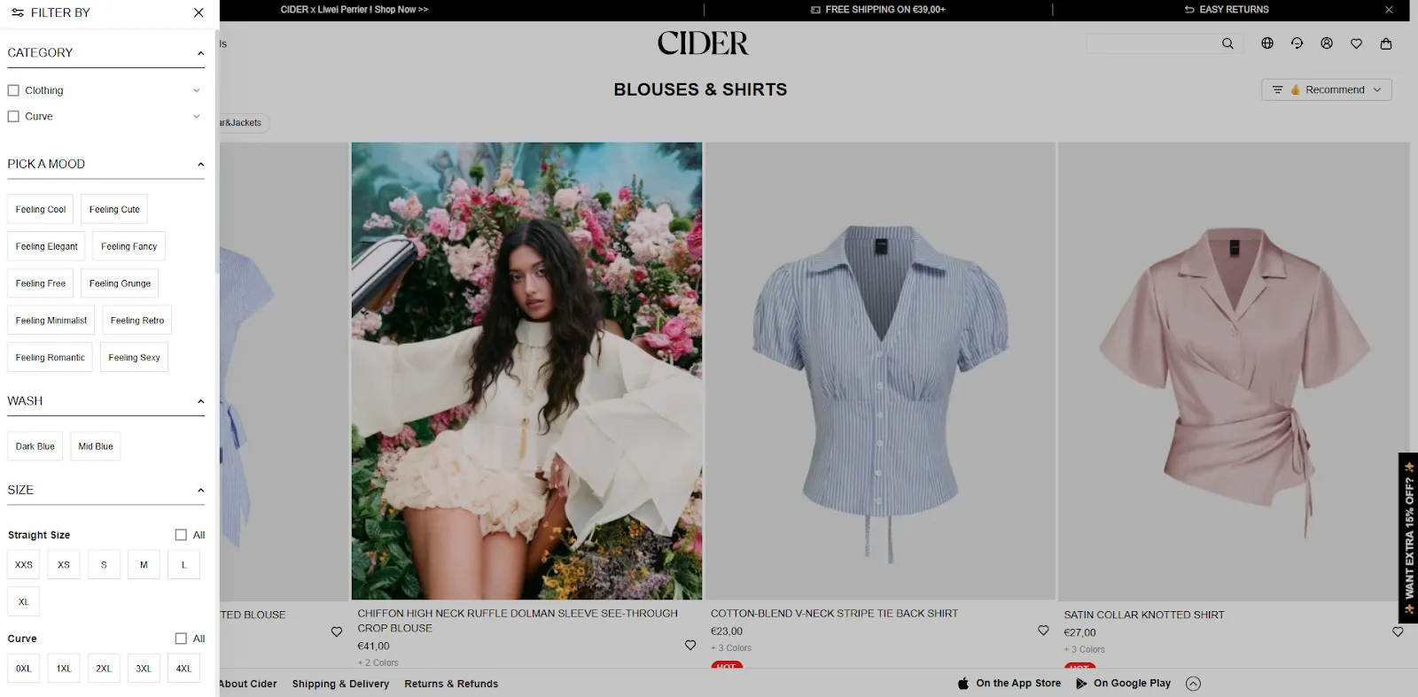
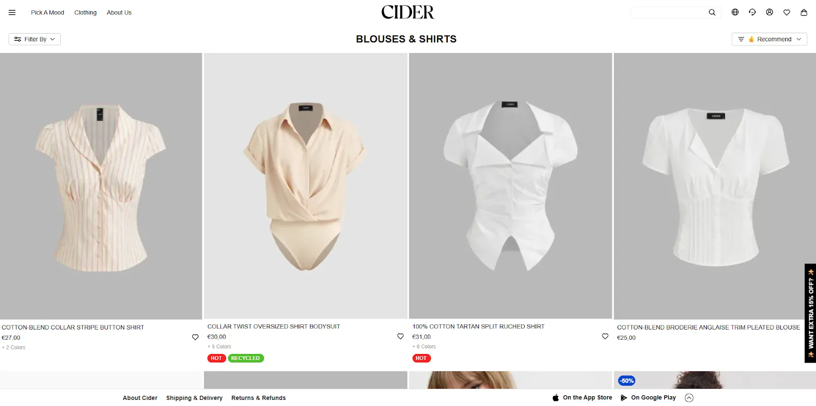
Cider’s filtering is spot on because it blends traditional filters like size and color with unique, emotion-driven tags like “Feeling Cute” or “Feeling Minimalist.” This not only helps users refine by style but also aligns with how shoppers feel when browsing – turning filtering into a more personal and engaging experience. It’s intuitive, inclusive (with both straight and curve sizing clearly split), and designed to reduce friction while enhancing discovery.
That said, if your category has just a handful of products, say two or three, filters aren’t necessary and might even clutter the experience. In these cases, I focus on making each product card shine and highlighting any special offers or key benefits right away.
3. Product Cards: Your Mini Salespeople
Those product cards you see on category pages? I like to think of them as mini salespeople working 24/7. Each card needs to quickly tell the shopper what the product is, why it’s great, and what to do next.
So what goes into a great product card? Clear, high-quality images are essential, of course. But also the right mix of information:
the product name
price (with discounts if applicable)
any social proof like star ratings
add nudging labels such as “best seller” or “organic cotton”
allow users to add products to their wishlist
make the whole product card clickable, not just the image
show available product colors, sizes, or variants directly on hover
allow users to zoom on product images on hovering
show alternate images or videos on hover
And last but not least: don’t forget the call-to-action “add to cart” to allow users to immediately add it to their shopping bag.
When I review category pages, I often spot cluttered cards with too much text or inconsistent layouts. It’s important to understand what truly matters to your users and carefully select the key elements to display – otherwise, you risk overwhelming your users.
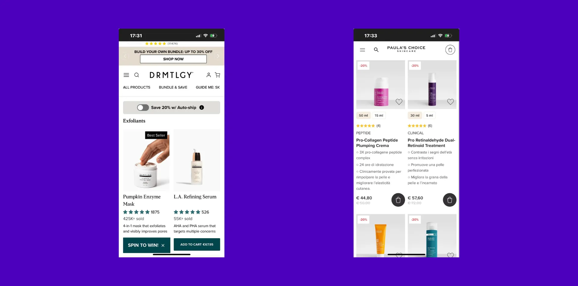
DRMTLGY’s product cards have a clean, minimal design that works well: short titles, concise descriptions, subtle nudges, and strong social proof – including how many units have been sold, which reinforces credibility and popularity. In contrast, the Italian version of Paula’s Choice takes a more text-heavy approach with longer titles and descriptions. On mobile, this results in a cramped two-card layout. While the discounted price is clearly highlighted, the small “Add to Cart” button may hinder usability, especially for mobile users trying to tap it quickly.
Usability is about thinking from your shopper’s perspective. Are buttons big enough to tap? Is the text easy to read? Is there enough space so the page doesn’t feel cramped?
A good rule of thumb I always use is to test on multiple devices and ask myself: “would I want to shop here?”
4. Speed and Usability: Don’t Let Slow Pages Kill Your Sales
If your category page takes too long to load or is hard to navigate, people won’t stick around. I’ve lost count of how many times I’ve left a site because the page was just too slow or the layout felt clunky on my phone.
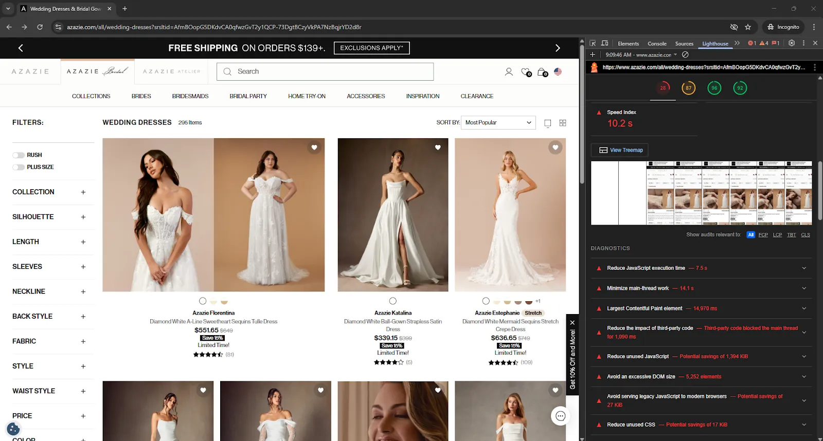
Optimizing for speed means compressing images, avoiding unnecessary scripts, and making sure your hosting is up to the task. Lighthouse is a great resource to test your page speed: remember to test it in incognito to have the cleanest possible test.
Unfortunately, Azazie’s website performance falls significantly below expectations. The site is noticeably slow and requires urgent fixes addressing multiple issues, including JavaScript inefficiencies and a high Largest Contentful Paint (LCP) time, among others
5. The Power of Labels and Badges
Here’s a trick I love: labels and badges on product cards. They’re small but mighty tools to draw attention and communicate key info quickly. Whether it’s a “20% Off,” “Best Seller,” or “Cruelty-Free” badge, these little visual cues help shoppers scan the page and pick out what’s relevant. In performance marketing, we also call this nudging.
Hot and Recycled are little nudges that immediately give users some additional information on the product, making them stand out even more.
I also recommend using labels to highlight product benefits or uses. For example, on a skincare site, labels like “For Dry Skin” or “Anti-Aging” save shoppers from reading through long descriptions. This makes browsing smoother and speeds up decision-making.
6. Content and SEO: More Than Just Products
Many ecommerce brands overlook the SEO and content potential of category pages. Adding a short, clear introduction that includes your main keywords can make a big difference in how your page ranks on Google.
I also suggest including helpful content below your product grid – things like buying guides, tips, or brand stories. This not only gives shoppers extra value but also helps your site stand out in search results.
Internal links to related categories or best-sellers can keep visitors engaged and exploring longer, which boosts conversions.
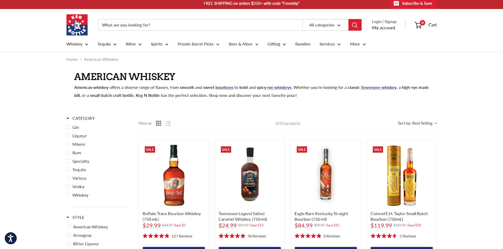
Keg N Bottle has a small intro text for categories, internal linking, and below the products, a longer outro text. No keyword stuffing, just relevant information for users that help both SEO and UX.
7. Personalization: Making Your Page Feel Tailored
If you have the tools, personalization is a game changer. Showing products based on a shopper’s browsing history, location, or purchase behavior makes the experience feel tailored and relevant.
I’ve seen clients increase conversions just by featuring “Recently Viewed” or “You Might Like” sections on category pages. That said, personalization should enhance, not overwhelm. Keeping it simple and relevant works best.
Some interesting personalization tools for Shopify are:
Visually: for A/B testing and personalization and behavioral targeting
8. Mobile-First Design: Because Most Shoppers Are on Their Phones
I can’t stress this enough: if your category pages aren’t optimized for mobile, you’re leaving money on the table. Mobile users expect easy navigation, fast loading, and clear CTAs.
Things like sticky filters or sorting bars help mobile users without taking up too much screen space. And making buttons large enough for fingers to tap easily is critical.
When I audit category pages, I always check how the layout adapts on mobile, looking for anything that slows down the experience or makes browsing frustrating.
Ever heard about UX Laws? Fitt’s Law is one of those UX Laws, and it explains that the time to reach a target, like changing filters, depends on how far away and how big that target is. By using a sticky (following) menu that stays close to the user, you reduce the distance they need to move, making navigation faster and easier, which can boost conversions.
I actually talked about Fitt’s Law (and much more) at Hero Conf UK in Brighton
9. Testing and Tweaking: Your Best Friend in Optimization
There’s no perfect category page that works for everyone.
At Hero Conf UK, I highlighted that A/B testing remains the gold standard for truly data-driven decision-making in CRO. It’s the most reliable way to validate hypotheses and remove guesswork.
However, I also emphasized the reality that A/B testing isn’t always accessible to everyone.
Challenges such as limited sample sizes, the need for specialized expertise, and longer implementation timelines can make A/B testing difficult – especially for smaller teams or for those who don’t focus on CRO full-time. Without the right resources and experience, the process can quickly become technically overwhelming.
That’s why it’s essential to approach CRO with flexibility, knowing when to test and when to rely on other data-informed strategies.
At Midsummer Agency, we proudly partner with VWO as an official partner, using their powerful platform to run and manage our CRO experiments effectively.
10. Avoiding Common Pitfalls
I’ve seen too many category pages get weighed down by unnecessary filters, slow load times, or confusing layouts. Oversized images that push important info below the fold, or cluttered menus that make navigation a headache, are all too common.
Also, vague product titles or missing CTAs confuse shoppers and reduce trust. On the flip side, too much information can be overwhelming – striking the right balance is key.
11. Little Details That Make a Big Difference
Sometimes it’s the small things that add polish and boost conversions. High-quality images that show the product clearly, with hover effects to show alternative views, help shoppers feel confident.
Quick “Add to Cart” buttons right on the category page speed up purchases. And social proof, like star ratings or review counts, builds trust – but only if you have enough reviews to back it up.
Also, highlighting free shipping or special promotions right on the category page can be a strong motivator.
Final Thoughts: Your Category Pages Are Your Sales Superpower
Optimizing ecommerce category pages isn’t just a nice-to-have; it’s essential. When done well, these pages become powerful engines that drive engagement and sales.
By focusing on clear navigation, smart filtering, compelling product cards, and mobile-first design, you make it easy and enjoyable for shoppers to find what they want.
Remember to keep testing, keep listening to your users, and don’t be afraid to make changes based on what the data tells you.If you want a hand crafting category pages that truly shine and convert, I’m here to help together with the rest of our conversion rate optimization team. After all, bright ideas and thoughtful design can transform your ecommerce store into a happy, thriving business.